Chapter 35 5. Visualize population data
35.1 5.1 Line plot by HSDA
A line plot can quickly show how population changes across age groups, but it is not always the best choice because age groups are categories rather than continuous values.
pop_total %>%
  ggplot(aes(x = Age, y = Population, group = HSDA, colour = HSDA)) +
  geom_line() +
  geom_point() +
  labs(
    title = "Population by Age Group and HSDA",
    x = "Age group",
    y = "Population",
    colour = "HSDA"
  ) +
  theme_minimal() +
  theme(axis.text.x = element_text(angle = 45, hjust = 1))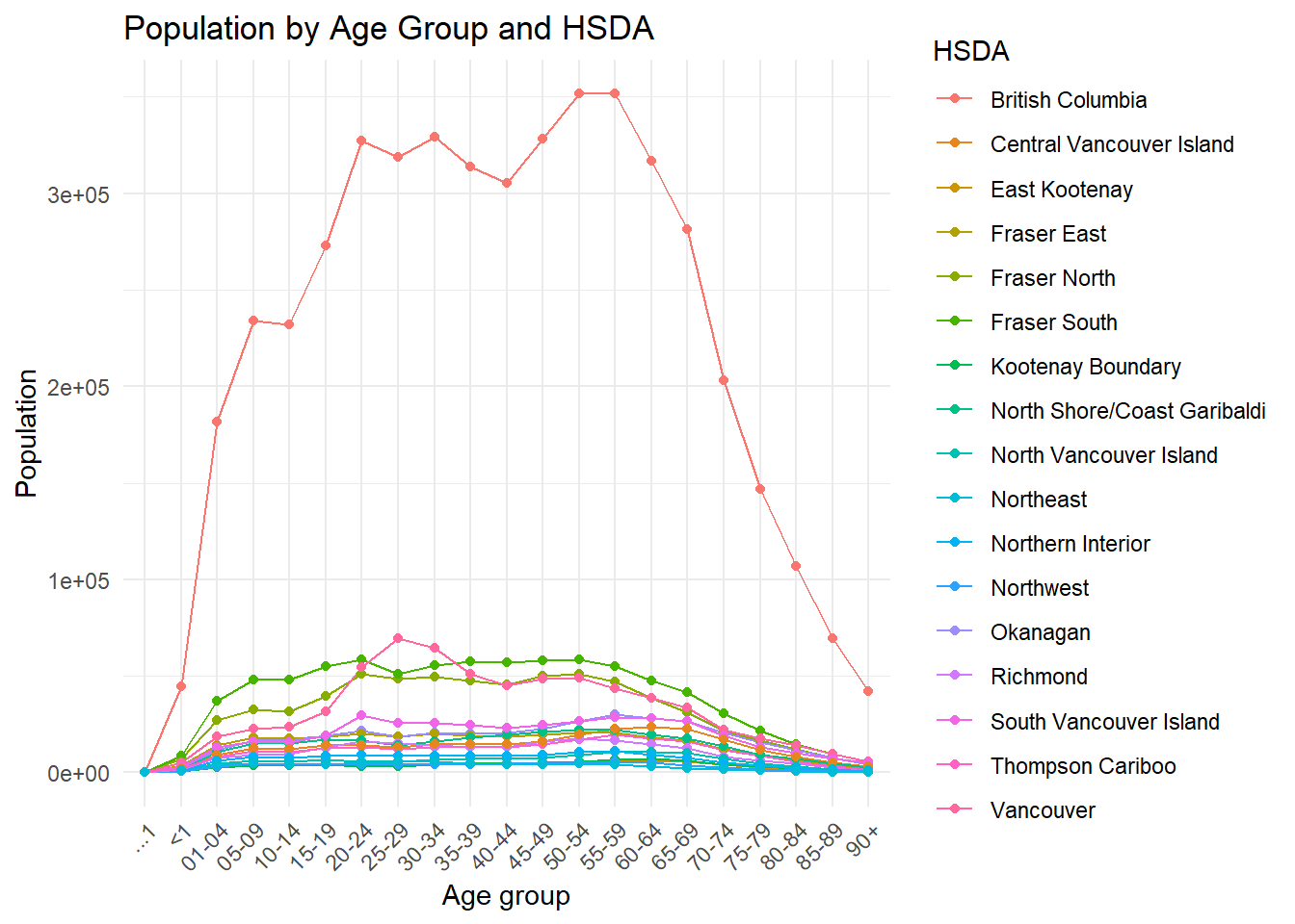
35.2 5.2 Bar plot by age group
For reporting, a bar graph may be easier to interpret because age groups are categorical.
pop_total %>%
  ggplot(aes(x = Age, y = Population, fill = HSDA)) +
  geom_col(position = "dodge") +
  labs(
    title = "Population Distribution by Age Group and HSDA",
    x = "Age group",
    y = "Population",
    fill = "HSDA"
  ) +
  theme_minimal() +
  theme(axis.text.x = element_text(angle = 45, hjust = 1))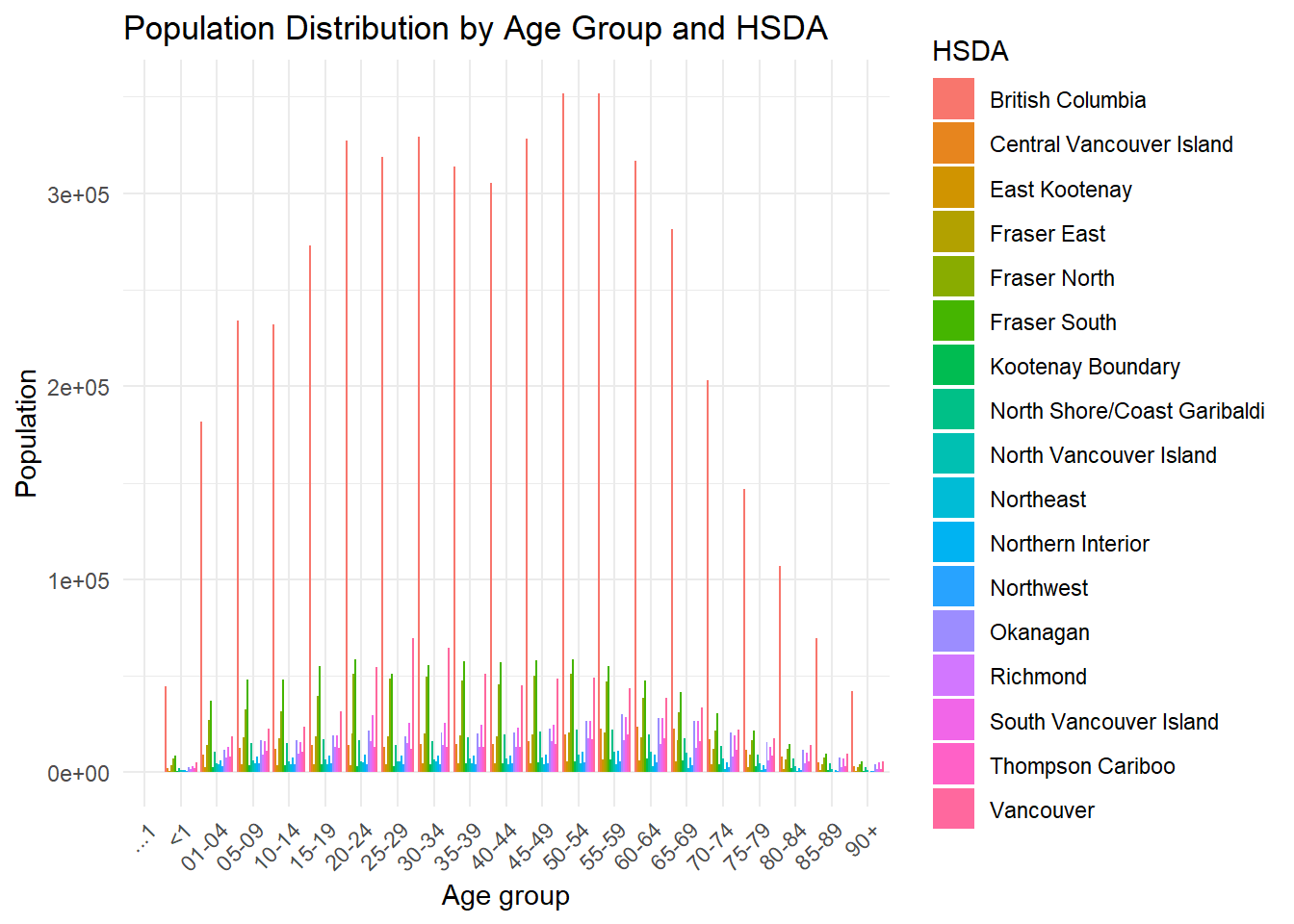
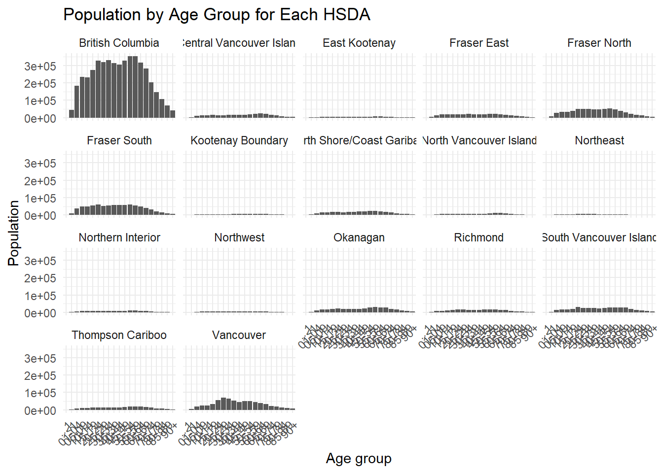
35.3 5.3 Optional: Faceted visualization
Facets are useful when the plot becomes too busy.
pop_total %>%
  ggplot(aes(x = Age, y = Population)) +
  geom_col() +
  facet_wrap(~ HSDA) +
  labs(
    title = "Population by Age Group for Each HSDA",
    x = "Age group",
    y = "Population"
  ) +
  theme_minimal() +
  theme(axis.text.x = element_text(angle = 45, hjust = 1))