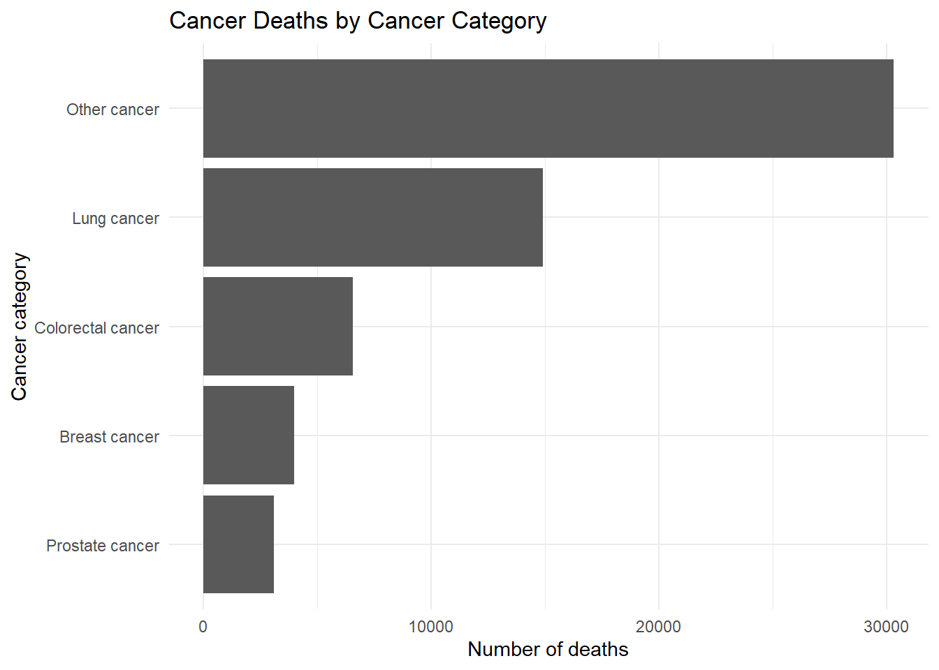
rates %>%
  count(CauseCat_label) %>%
  ggplot(aes(x = reorder(CauseCat_label, n), y = n)) +
  geom_col() +
  coord_flip() +
  labs(
    title = "Cancer Deaths by Cancer Category",
    x = "Cancer category",
    y = "Number of deaths"
  ) +
  theme_minimal()
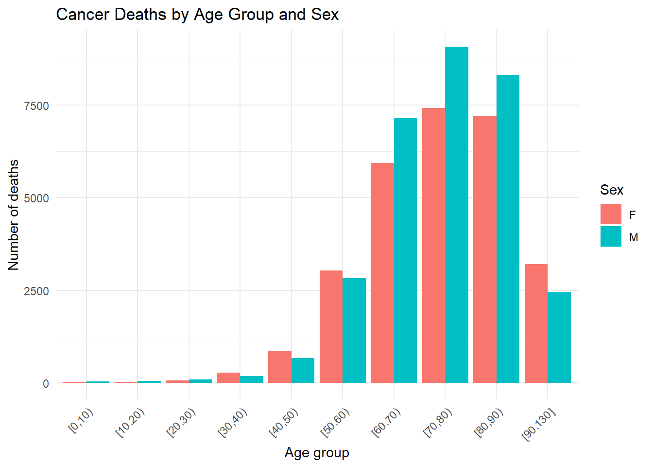
rates %>%
  count(AgeCat, Sex) %>%
  ggplot(aes(x = AgeCat, y = n, fill = Sex)) +
  geom_col(position = "dodge") +
  labs(
    title = "Cancer Deaths by Age Group and Sex",
    x = "Age group",
    y = "Number of deaths",
    fill = "Sex"
  ) +
  theme_minimal() +
  theme(axis.text.x = element_text(angle = 45, hjust = 1))